In Chemistry, we researched how many people lived in our area and compared them with past years. We compared the year 2000, 2010, and 2015. This is the population growth. This is shown both as a line graph and a chart.

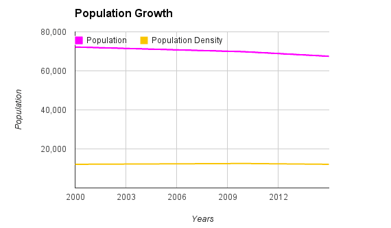
What I noticed was that over the past 15 years, the population slightly decreases. The year with the highest population is year 2000, and 2015 had the lowest year. I think the reasoning of this is because there has been a slight increase in violence and crime, so I think that made some people move out of the neighborhood and not want to move in.
 RSS Feed